Feleena’s Cantina
BRANDING
Overview
In my final year of Graphic Design, I revisited a past project with the goal of refining and improving it. I chose to redesign a logo I originally created for Feleena’s Cantina, a well-known restaurant in Ottawa’s Glebe.
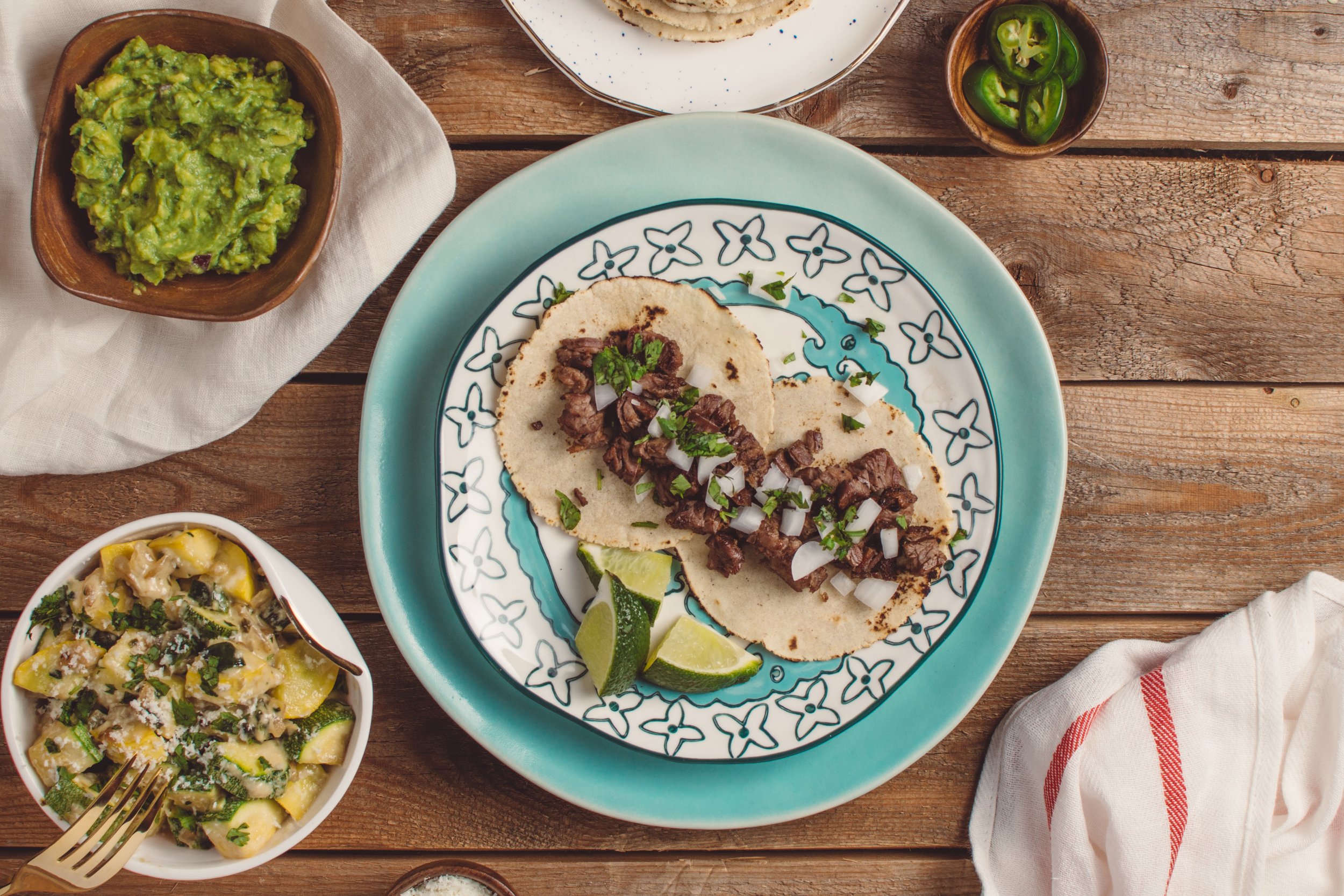
Feleena’s is a charming, authentic Mexican spot that has been serving the community for over 38 years. Known for its vibrant atmosphere and rich use of colour, the space is just as expressive as its food, making it the perfect inspiration for a refreshed brand identity.
The Original
While the original logo was strong, it didn’t fully capture the unique character of Feleena’s. Its modern, contemporary style didn’t reflect the authenticity of the cuisine or the vibrant, artistic atmosphere of the space. With colourful decor, detailed artwork, and hand-painted murals throughout the restaurant, the brand needed an identity that felt as expressive and true to it’s roots.


The Inspiration
As a graphic designer, my inspiration comes from real experiences and deeper understanding. When I first created this logo, my knowledge of Mexican culture was limited. Since then, I’ve visited Mexico twice, with a particularly meaningful stay in La Cruz de Huanacaxtle, where I experienced the local food, art, and traditions firsthand.
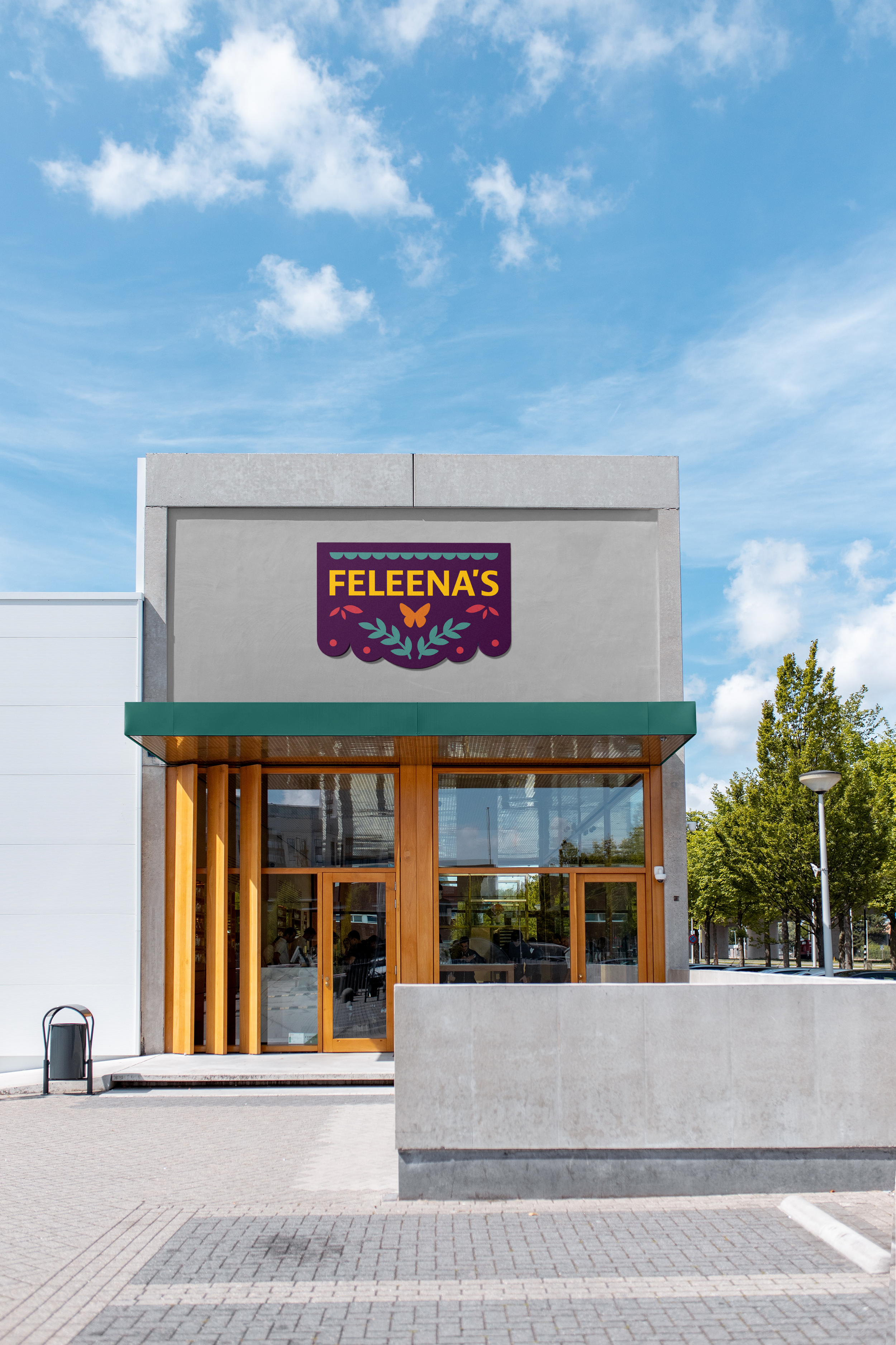
One art form that stood out to me was papel picado, which helped shape my redesign. I also incorporated a monarch butterfly, a symbol deeply rooted in Mexican culture. This concept is reflected in the hand-painted butterfly mural on the restaurant’s exterior, welcoming guests into a space that celebrates Mexico’s rich culture.
The New Identity


The Outcome


